FREE delivery on UK Orders over £200 - Worldwide Delivery Available
+44 (0) 1273 495500
Red room decor ideas create an immediate strong impression that are not for the feint of heart. For the brave, this guide shares the tips and tricks for balancing the most popular red tones in interior designs.

Red
"A colour at the end of the spectrum next to orange and opposite violet, as of blood, fire, or rubies."
Red is the most powerful and alluring colour you can select. With a dual identity signifying both love and danger, using red in your interior can have a truly striking effect. It is commonly used to represent signs of romance and passion. Just think of the internationally celebrated Valentine’s Day where signs of affection are traded across the globe. The red rose is also the most traditional symbol of romance with its natural beauty and perfection.
Red has also been proven to make a person feel more powerful because of its associations with danger. This accounts for people's reticence in using it and strong recommendations for moderation.
Here's how to use the most popular shades and how to complement them for flawless, fabulous home decorating.
Scarlet Red Interior Design Ideas
Scarlet is a bold, vibrant shade of red that brings life and youthful energy to a room. Balancing it with white, cream or neutral makes for a smart finish. Otherwise, lean in to the effect with a big pattern that uses it as a pop of colour like in a tropical print. Botanical designs put it in the context of a shade seen in the wilds of nature.


Shop the Look...
-
-
 Varese VelvetOut of stock
 -


Rustic Red Interior Design Ideas
Rustic red tones are closer to orange on the colour spectrum. They are much like terracota with their dusty, dusky finish. They are also ideal for adding depth to a space. Rustic red is particularly well suited to country homes and vintage inspired interiors.
As a muted hue this aged look can be used on larger furniture and works particularly well with dark colours and pale blue. Again, in smaller spaces it's wise to partner them in light neutrals (white, cream, grey, beige) for a clean, updated feel.


Shop the Look...


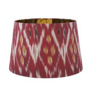
Wine Red Interior Design Ideas
Wine red is particularly imbued with romance and, like the beverage its named after, comes in a range of rich and decadent hues. As all reds, white, neutral, and cream offer the optimum lift.
This tone, however, can also be complemented by equally strong colours like mustard yellow or ochre. Similarly, forest green can be paired beautifully.


Shop the Look...
-
-
 Mikado Plain Velvet FabricOut of stock


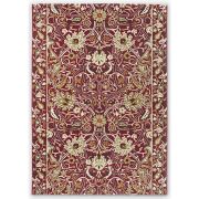
Burgundy Red Interior Design Ideas
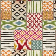
Burgundy falls between brown and a deep purple; it's both earthy and has the warmth and passion of red. This tone can hold large designs and create small ones. Tribal patterns and geometric shapes, in particular, can be used on any scale.
Use burgundy with navy to create a moody interior. Whereas, gold and/or turquoise bring a contemporary twist.


Shop the Look...


You May Also Enjoy Reading...

Cosy Attic Room With Red Feature Wall
How our client used red wallpaper to create a feature wall in their attic renovations for a wonderful effect.

Navy Blue and Red Living Room Scheme
This colourful living room combines red and blue over a neutral background for a welcoming space.
Copyright 2024 F&P Interiors. All rights reserved.
- paypal
- visa
- mastercard
- amex