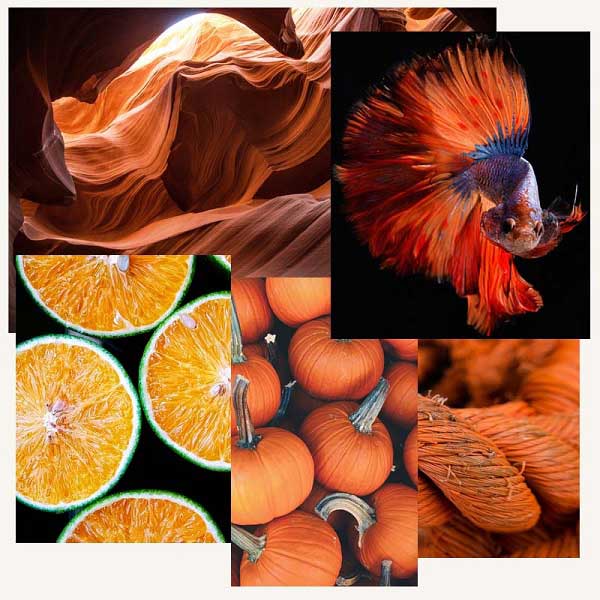
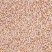
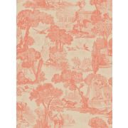
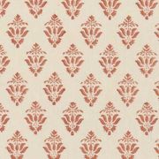
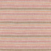
Orange interior design ideas add uplifting warmth to any room. A zesty makeover is a bold step that creates a show-stopping look.


Orange
"A reddish yellow, associated with the feeling of excitement and energy."
The colour orange was named after the fruit which has made the two inextricably linked. It can also, however, bring to mind honey tones, baked terracottas, and soft sunsets.
Orange is a vibrant colour, bursting with confidence and flair. It's definitely for the adventurous, who are willing to make a statement. Pairing perfectly with dark blues and greens, it's the ideal solution for adding a pop of colour to otherwise muted spaces.
In interior design, orange is a bright and cheerful shade that offers a boost. It will always have a positive, rejuvenating and enriching effect on anyone's mood, which makes it ideal for starting any day whether in kitchens, dining rooms or bedrooms.
Read on to find out more about the different shades of orange and how best to style them in your interior...
Tangerine Orange Room Ideas
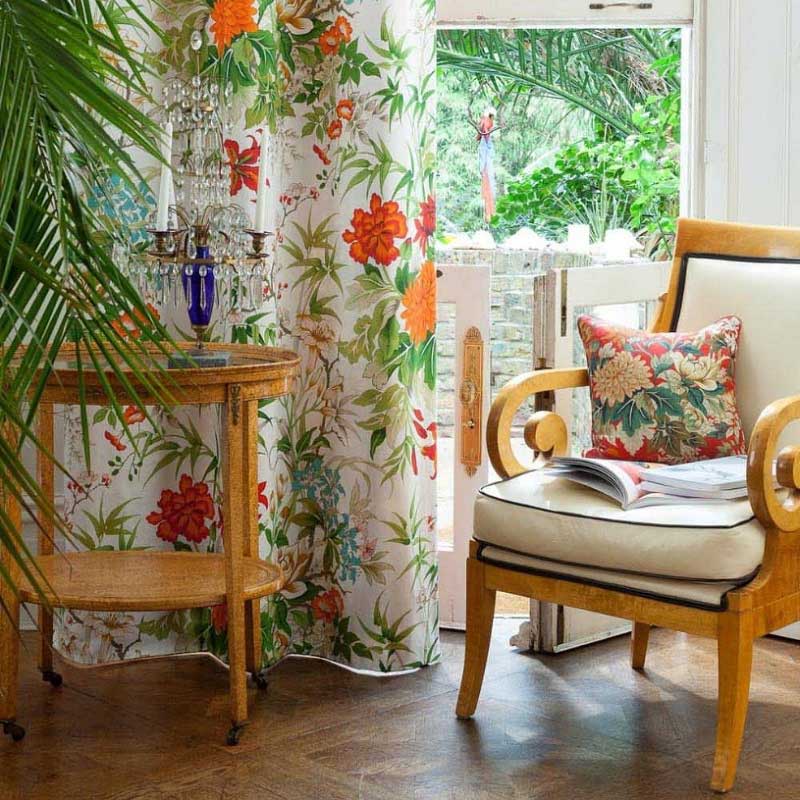
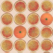
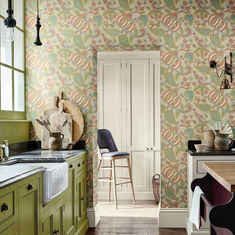
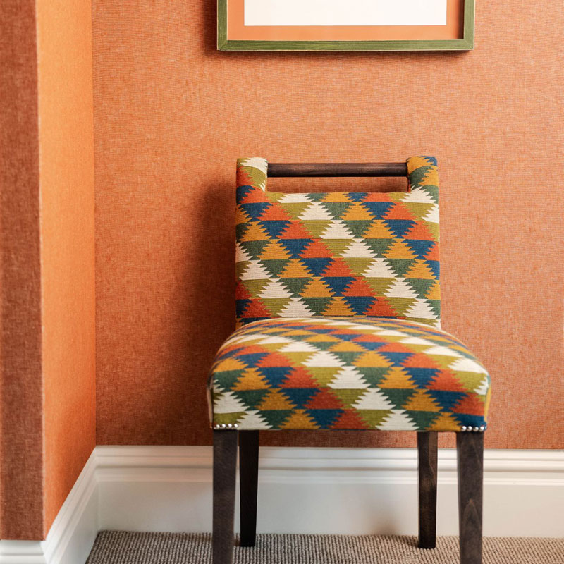
Citrus shades are often the first thing people think of when they hear 'orange'. They're full of energy and life, and add both to interiors. These bright fruity tones naturally go well with green.
They can look great side by side as block colours for young modern spaces. They also work wonderfully together in patterns. Floral and tropical prints, in particular, make the most of this punchy pairing.
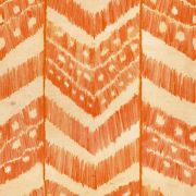
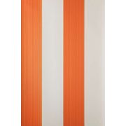
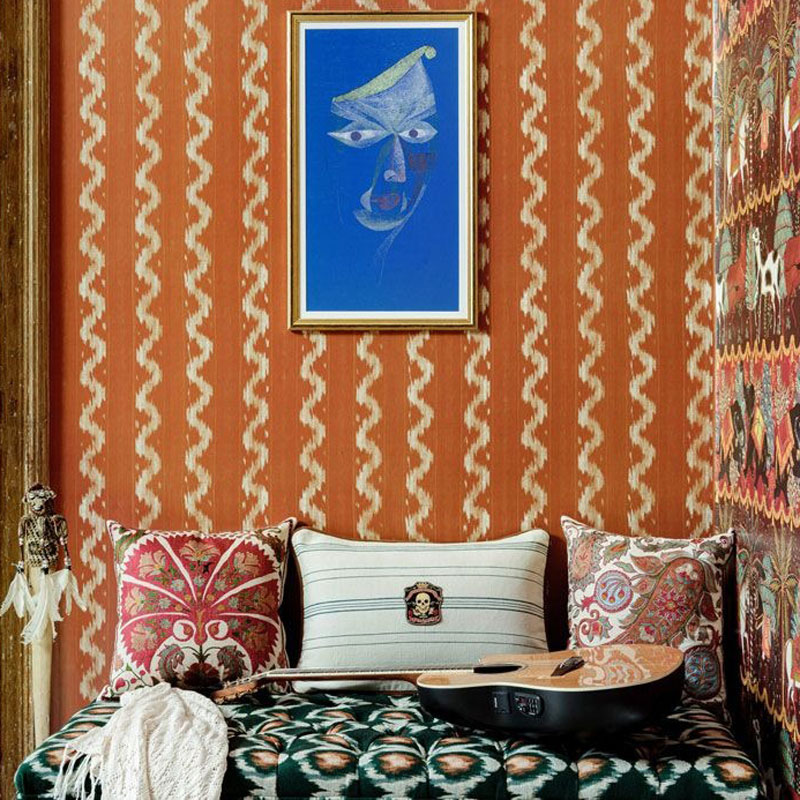
Off-white, grey, and neutral tones, on the other hand, balance shades of tangerine orange. The results are modern rooms, and furnishings for inside and outside the home. An effortless way to achieve this look is by using a stylish geometric pattern.
Burnt Orange Room Ideas
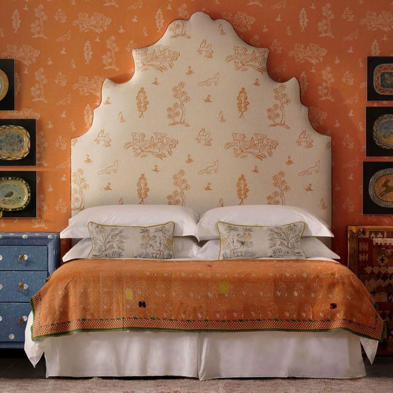
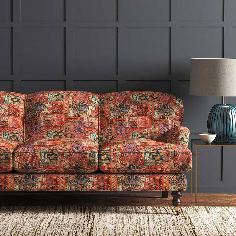
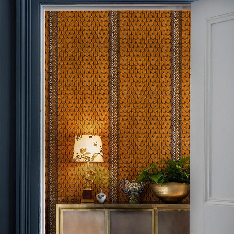
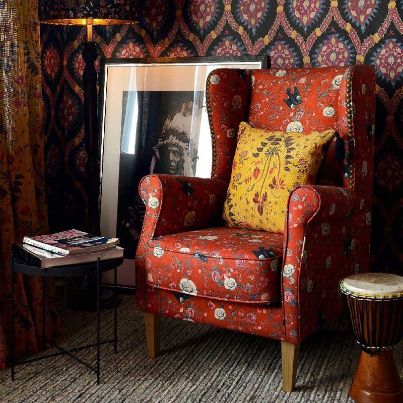
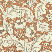
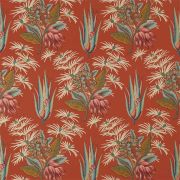
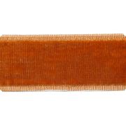
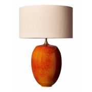
Burnt orange is an earthy shade with undertones of brown that bring to mind crisp autumnal leaves and crackling fires. These shades create cosy interiors that last year-round.
This effect can be built upon by using other tones that likewise evoke imagery of the changing seasons. Ochre yellow and deep wine red hues emphasise this look.
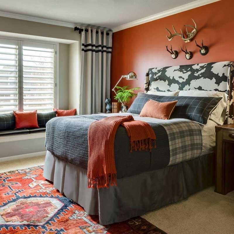
Burnt orange is perfect for adding a gender-neutral colour to shared spaces like living rooms. They're also a great way to use in darker spaces and in more masculine interiors like a home office or bedroom. Try using charcoal grey as an accompaniment to this tone for a strong, tailored finish.
More of Our Favourite Burnt Orange Products...
Coral Orange Room Ideas
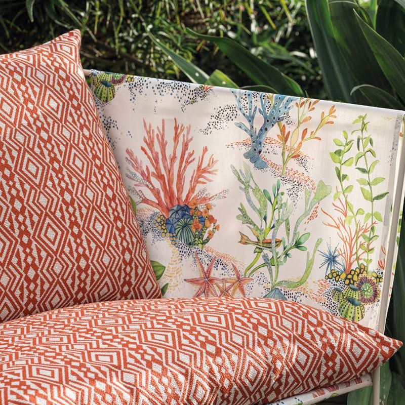
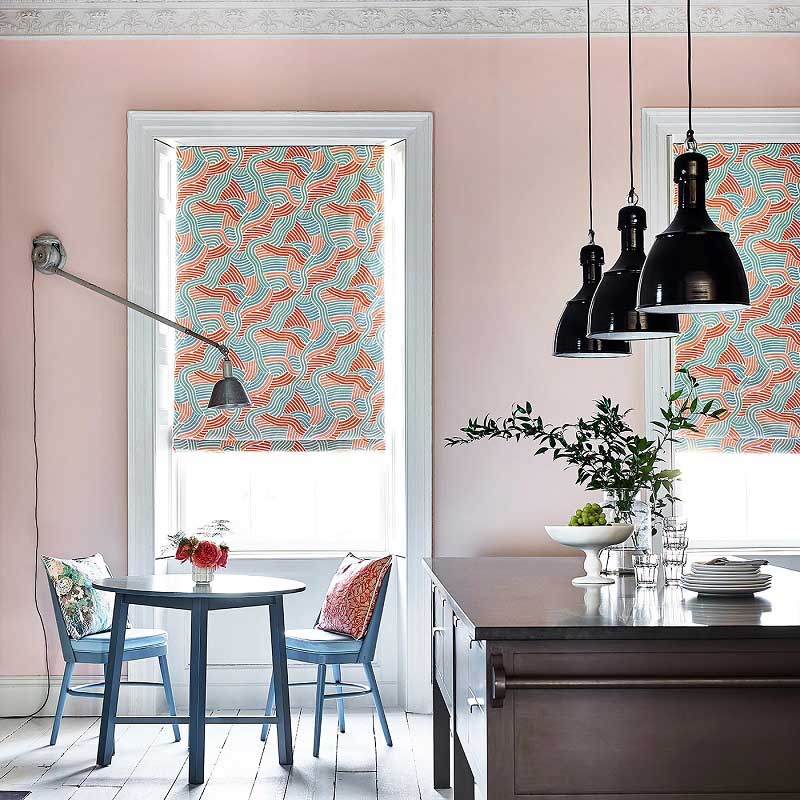
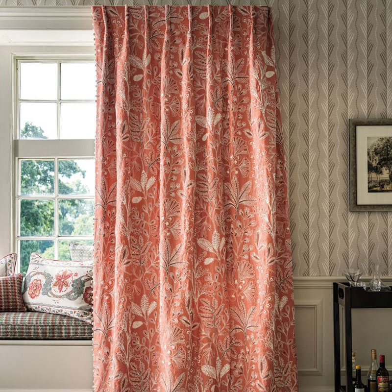
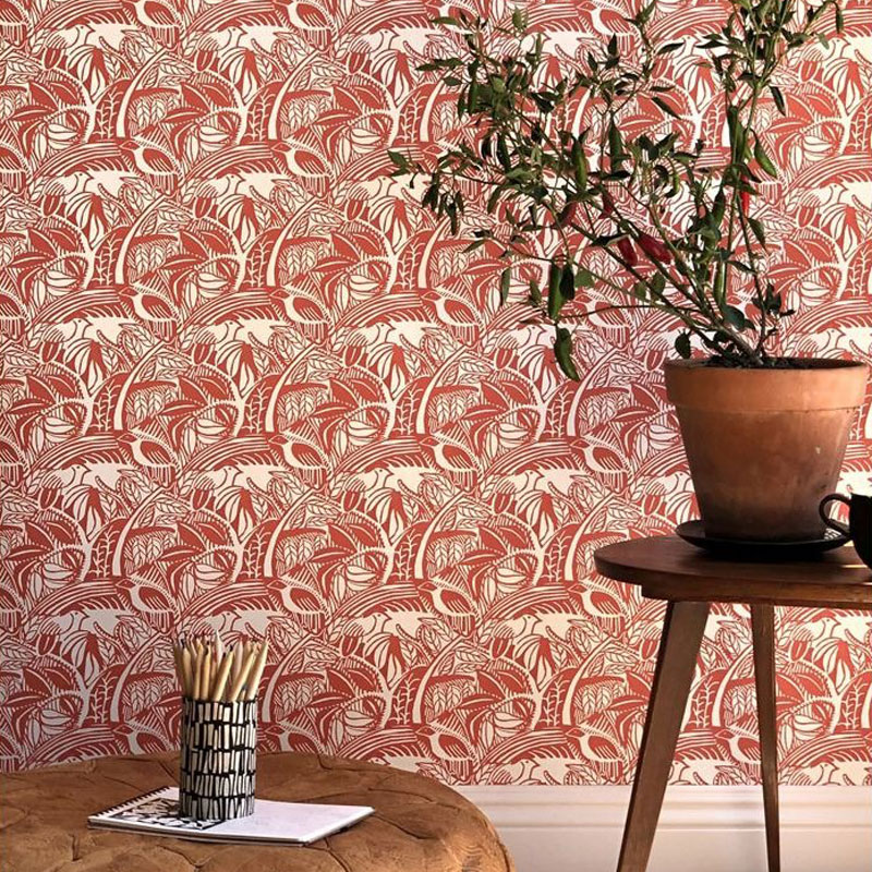
Coral is a shade between pink and orange, and it's a celebration of the sea life it's associated with. This means it works beautifully with ocean greens, turquoise, and blue hues, as well as pink tones.
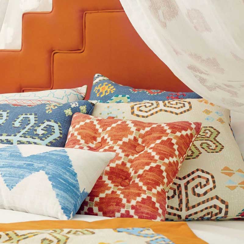
It's a youthful and summery colour that's ideal for home accents. Feature walls, cushions, and blinds all make stunning additions to interiors.
More of Our Favourite Coral Orange Products...
Blood Orange Room Ideas
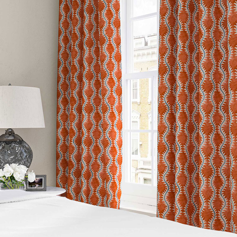
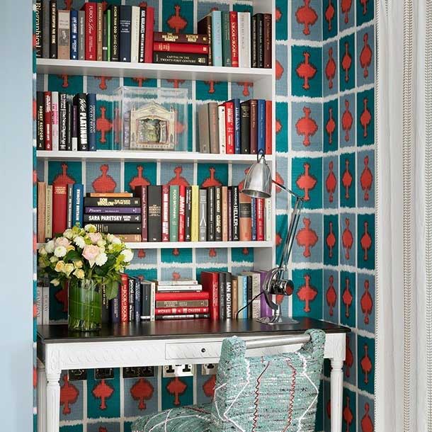
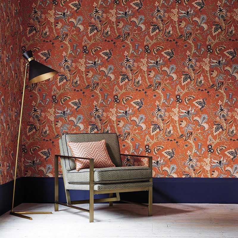
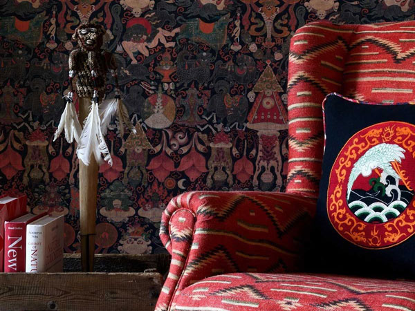
Blood orange, on the other hand, is closer to red on the colour spectrum. This rich shade is complemented by dark blue tones.
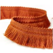
They can be combined in spectacular patterns for making an eye-catching interior. This can then be continued in finishing touches. Blood orange can be balanced by dark blue paint on the skirting board or on painted furniture. Whereas, a trimming on curtains or as piping on cushions and upholstery tie a room together.
More of Our Favourite Blood Orange Products...
You May Also Be Interested In...
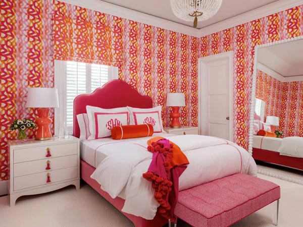

Pink and Orange Decorating Ideas
These vibrant and energetic tones look absolutely great when styled together, get inspired to use them in your home!
- paypal
- visa
- mastercard
- amex

