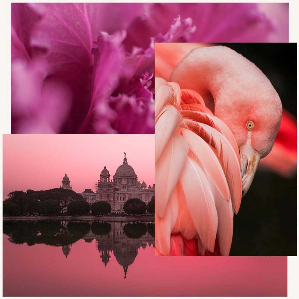
Pink interior design ideas add a sense of femininity to any room. A rosy makeover is a bold step but when done well; you create a show-stopping look.


Pink
"Of a colour intermediate between red and white, as of coral or salmon."
Historically, pink was a typically masculine tone. Red symbolised war and pink was the closest shade making it the fiercest colour a male could wear without the connotations of war.
The meaning has since completely flipped. Pink is now imbued with a maternal and tender nature but also an air of innocence and youth.
The history of pink means it isn't, however, simply a delicate colour. It's intriguing and powerful, playful and punk, serene and sensuous.
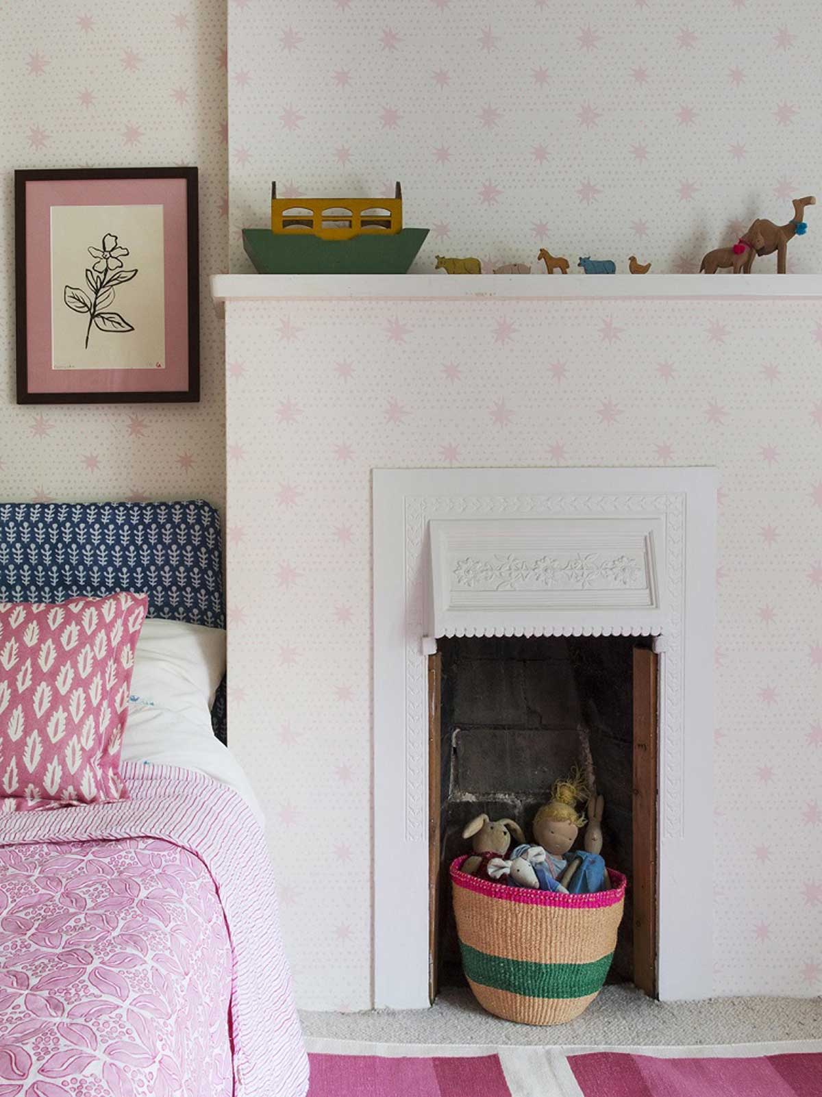
Pale powdery pink tones are calming and ideal for nurseries. Whilst, dusky hues offer the same tranquil effect with a touch of romance.
Hot pink colours bring vibrancy and immediacy to a space that's perfect for a pop of colour or a bold statement. Then again, deep tones offer a warm and somewhat daring backdrop.
Here's the pink interior design ideas to try for yourself.
Blush Pink Room Ideas
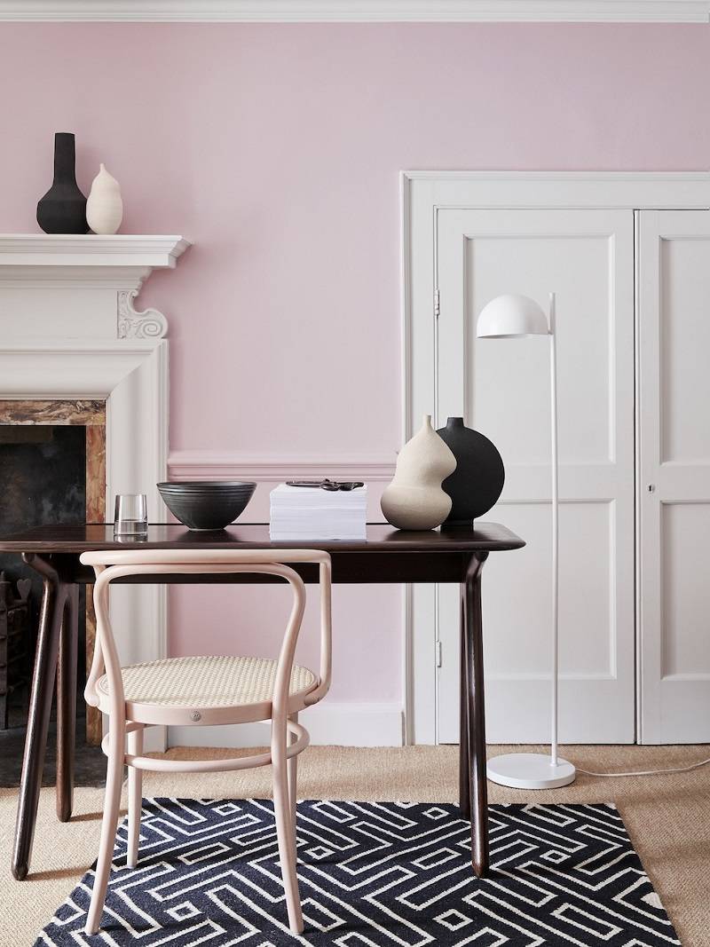
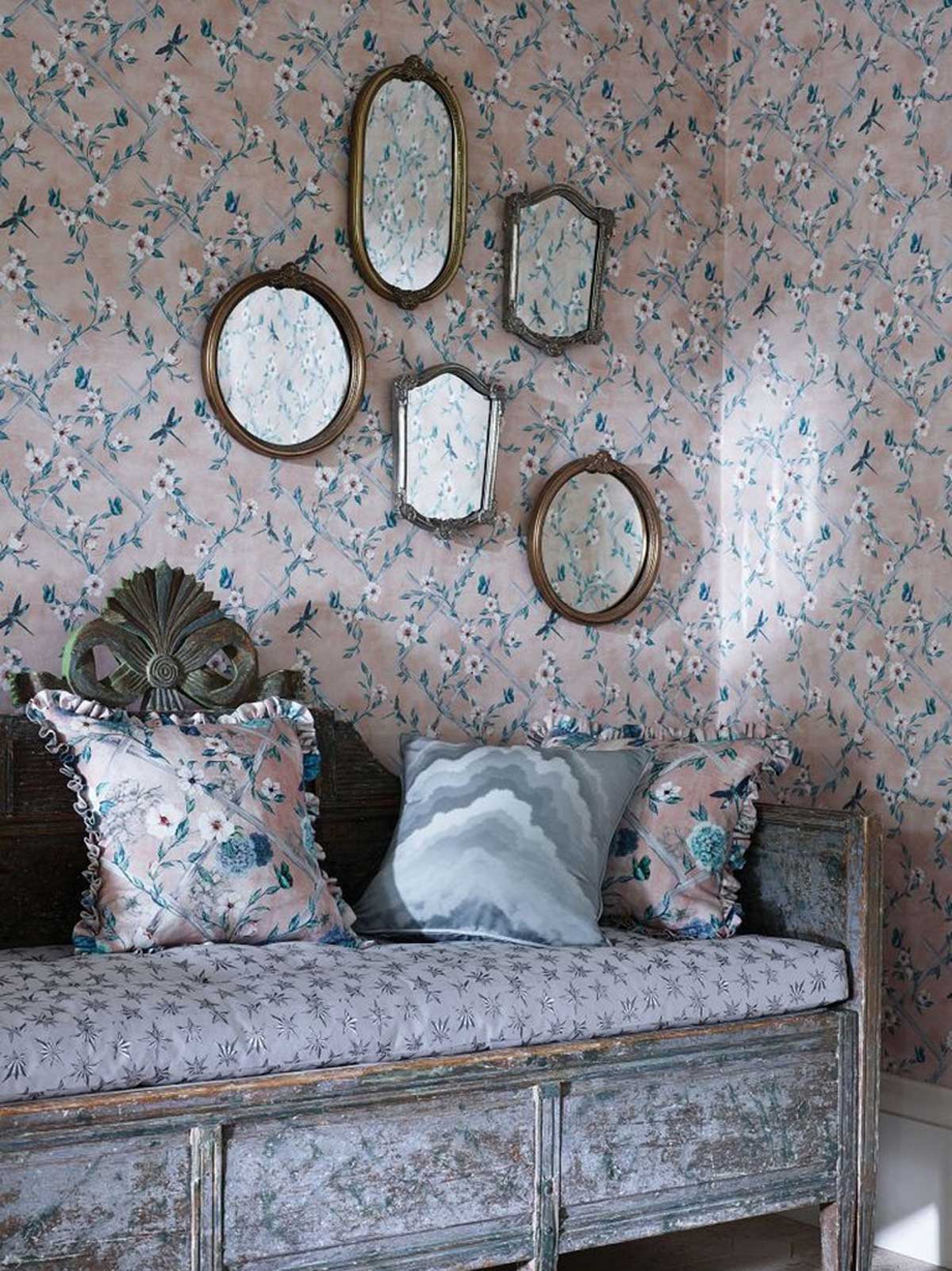
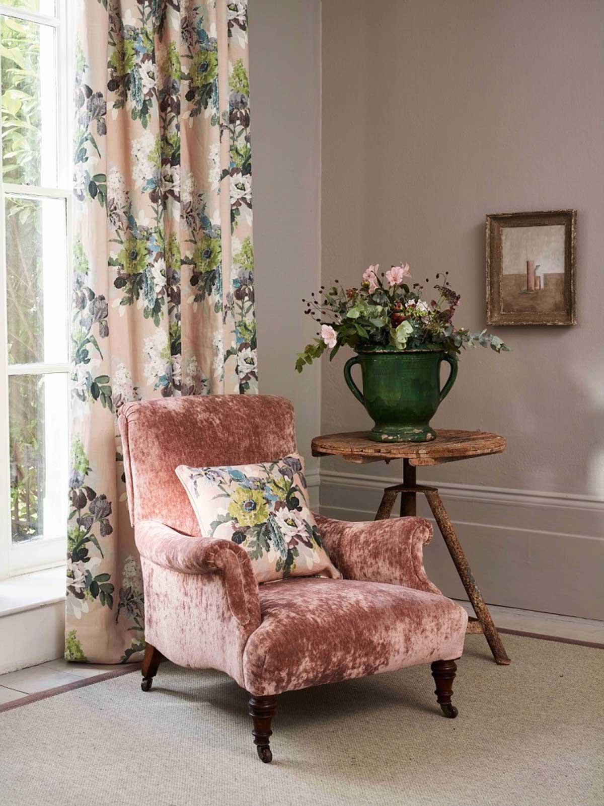
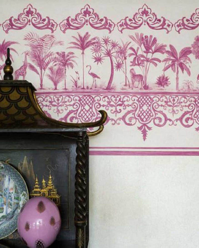
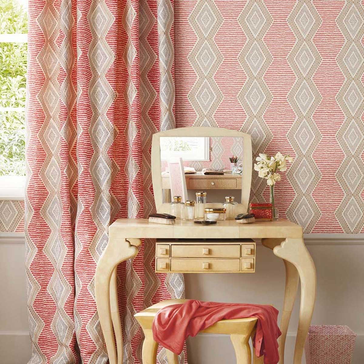
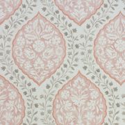
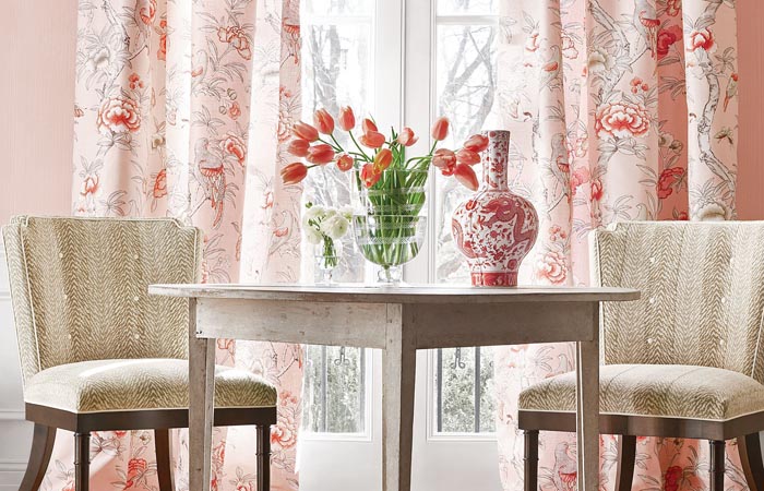
Blush pink takes its name from natural and rouge cheek colouring, as a result it has a touch of peach. These pale pink tones lift an interior, year round. Couple blush pink with white or cream, in the design itself or side by side, to emphasise this effect.
To complement this hue further, pair with shades of green. A mint green brings a sense of retro youth. Meanwhile, a rich green or teal offers a sophisticated, timeless feel.
Blue tones, particularly navy, can mute blush pink for a more dusty finish. This technique is ideal if you want to use pattern on pattern in an interior. Their clash for attention balances them both out.
Finally, gold emphasises the powder connotations for an on-trend Millennial pink interior scheme.
Shop the Look...
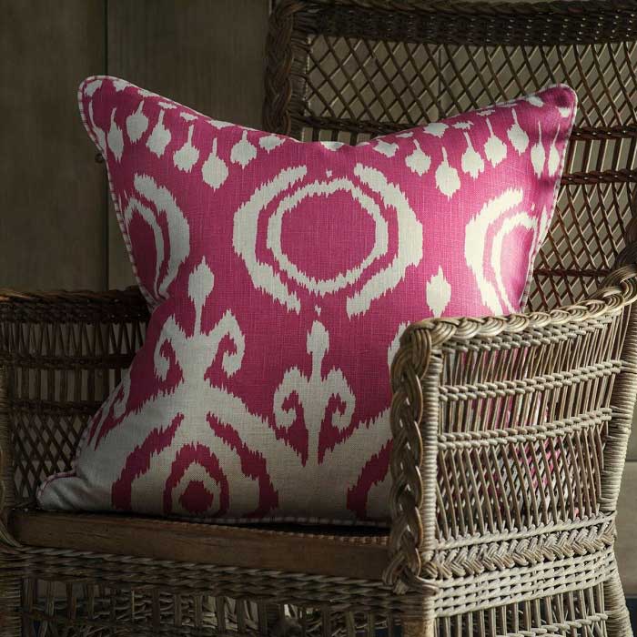
Fuchsia Pink Room Ideas
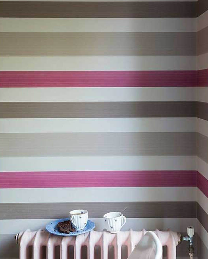
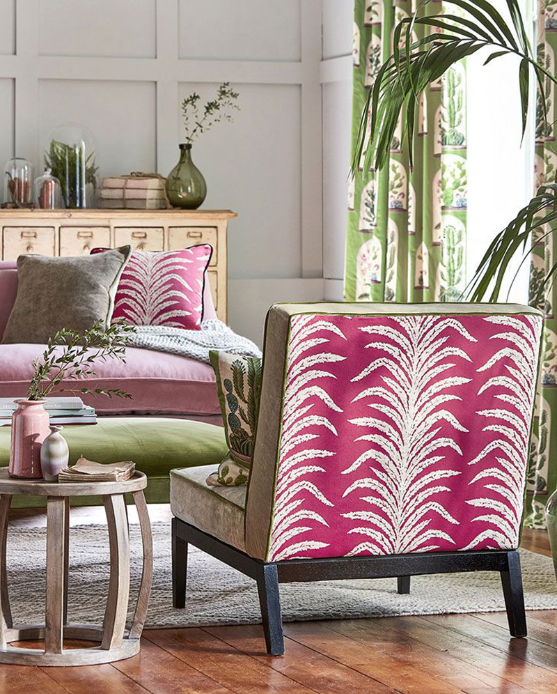
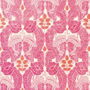
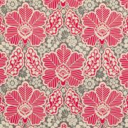
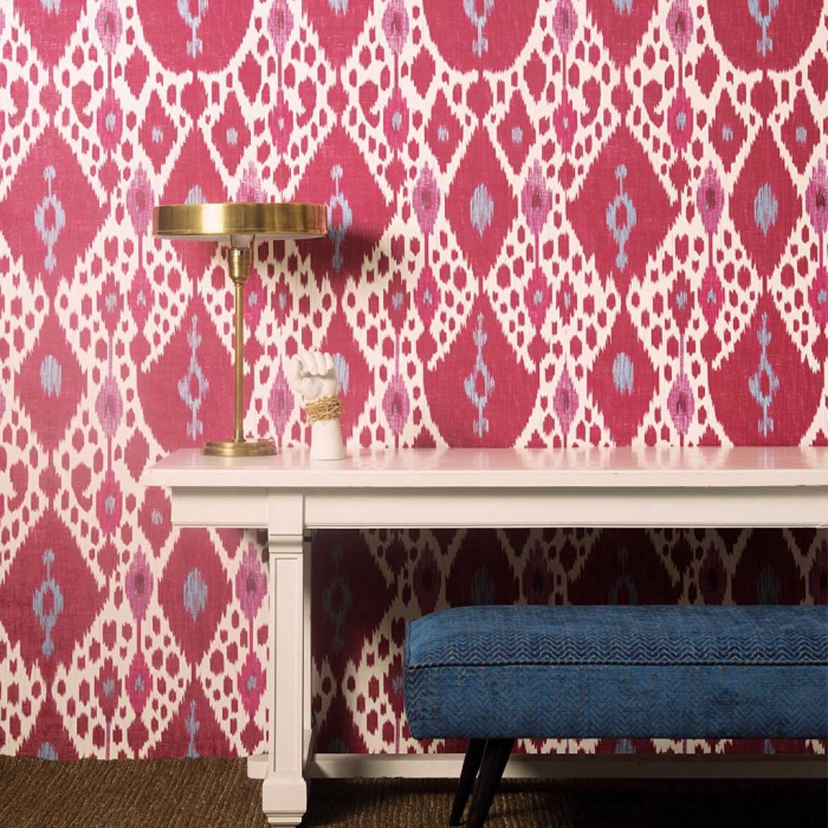
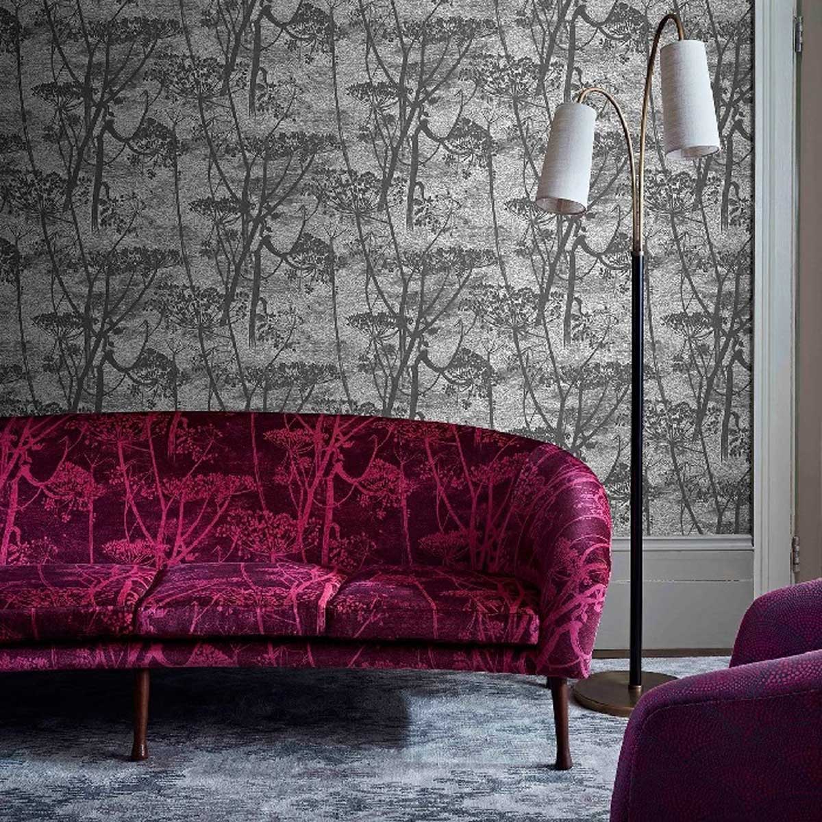
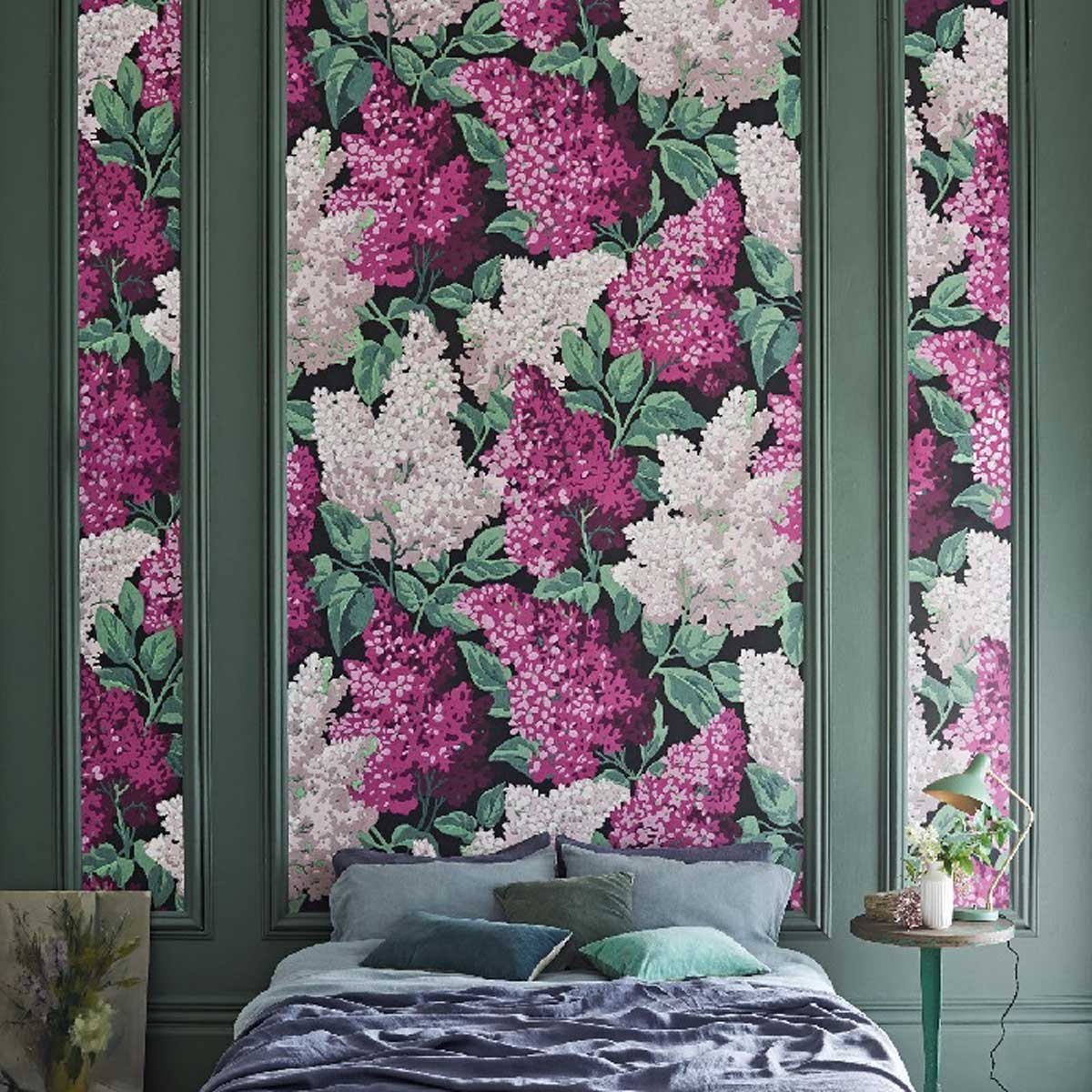
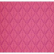
Fuchsia pink has undertones of blue giving it a more electric, punchy appearance. As a mid-pink, it works wonderfully with lighter and darker tones; in a pattern or through shading.
Using tone on tone or paired with an off-white gives fuchsia more oomph. Grey, on the other hand, gives a demure twist to this vivacious hue.
Shop the Look...
Coral Pink Room Ideas
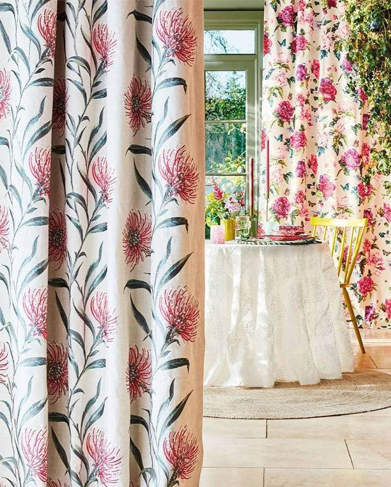
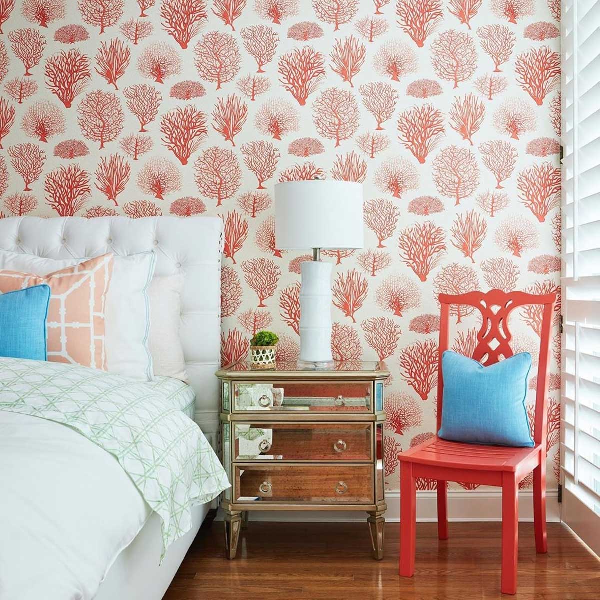
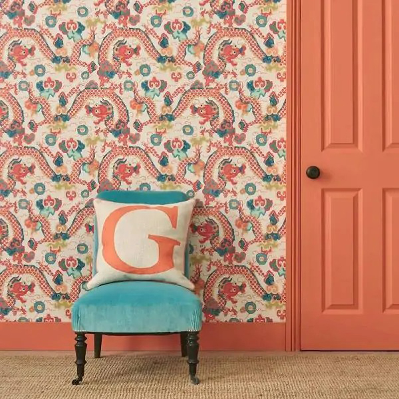
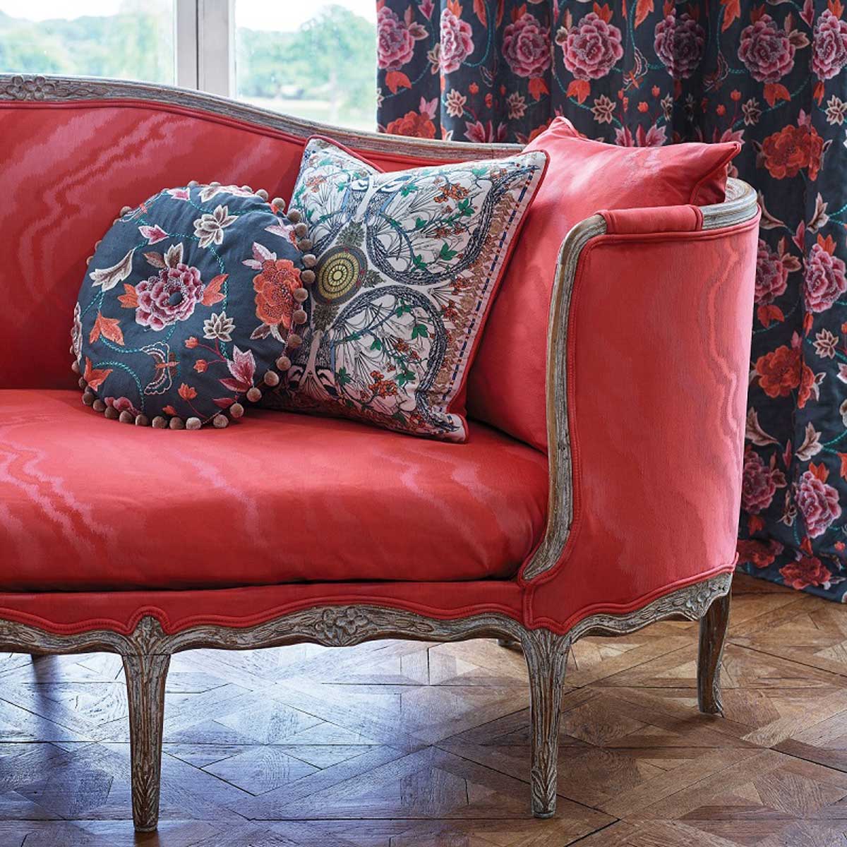
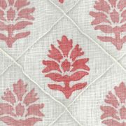
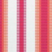
Coral pink is an orange-pink shade that contrasts brilliantly with blue for a coastal theme. Whereas, grey or a neutral taupe temper its boldness.
It's also entirely on-trend thanks to Pantone's Colour of the Year 2019, Living Coral. Adding a splash to a room is perfect for a stylish colour pop.
Shop the Look...
You May Also Enjoy Reading...
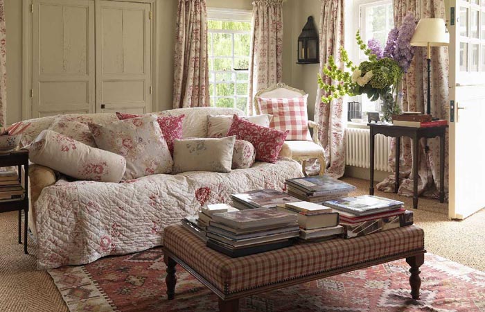

The English Country Linens Collection
Featuring charming motifs that capture the joy of the British outdoors in a wonderfully adaptable colour palette, enjoy our range of beautiful patterned fabrics.
- paypal
- visa
- mastercard
- amex

