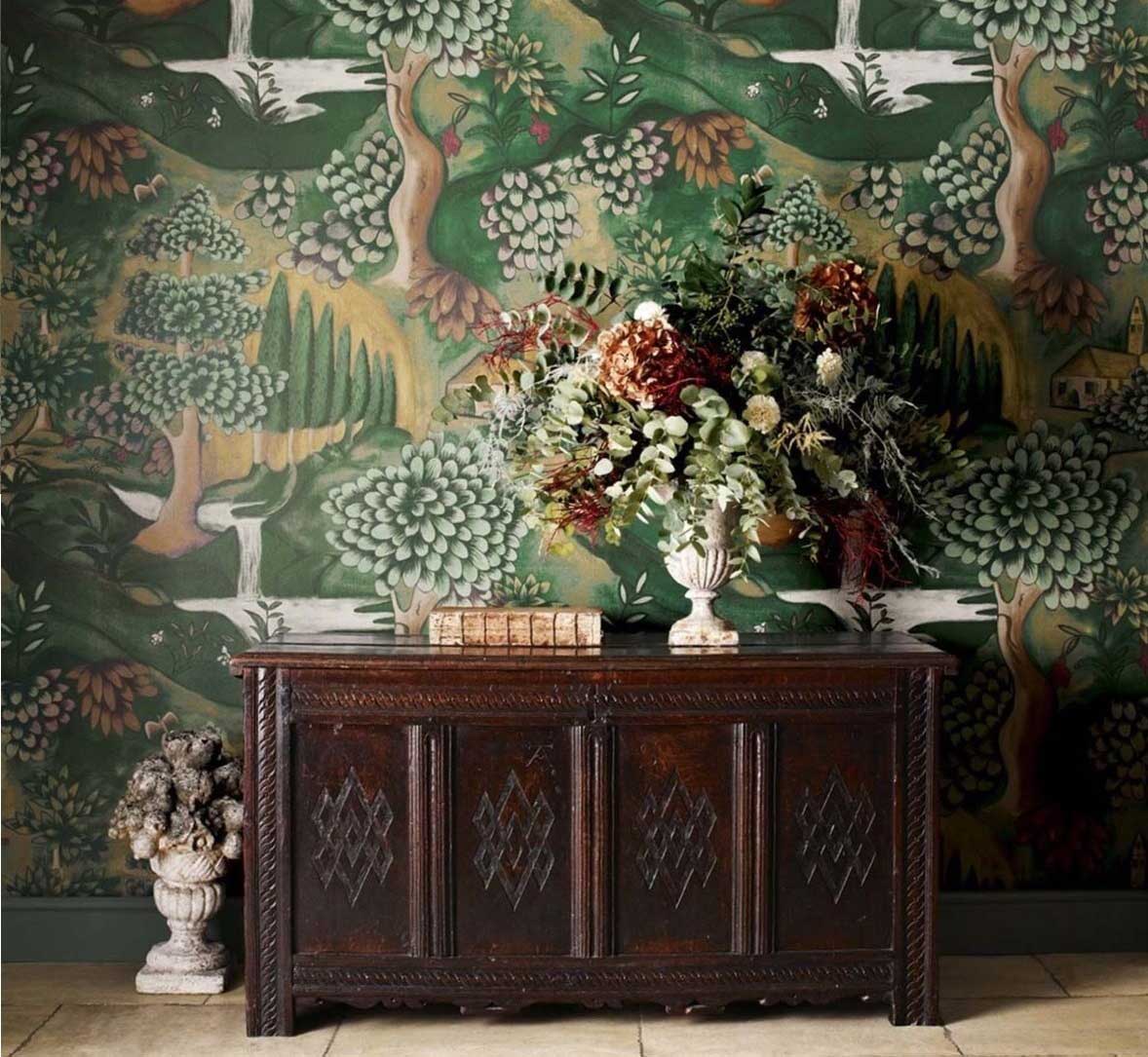
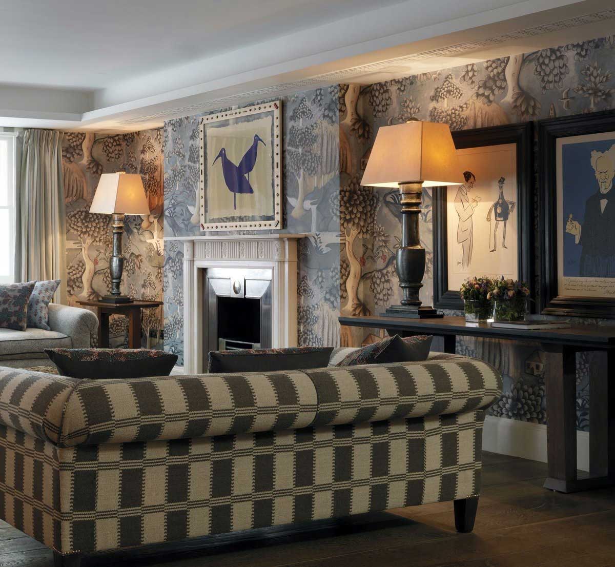
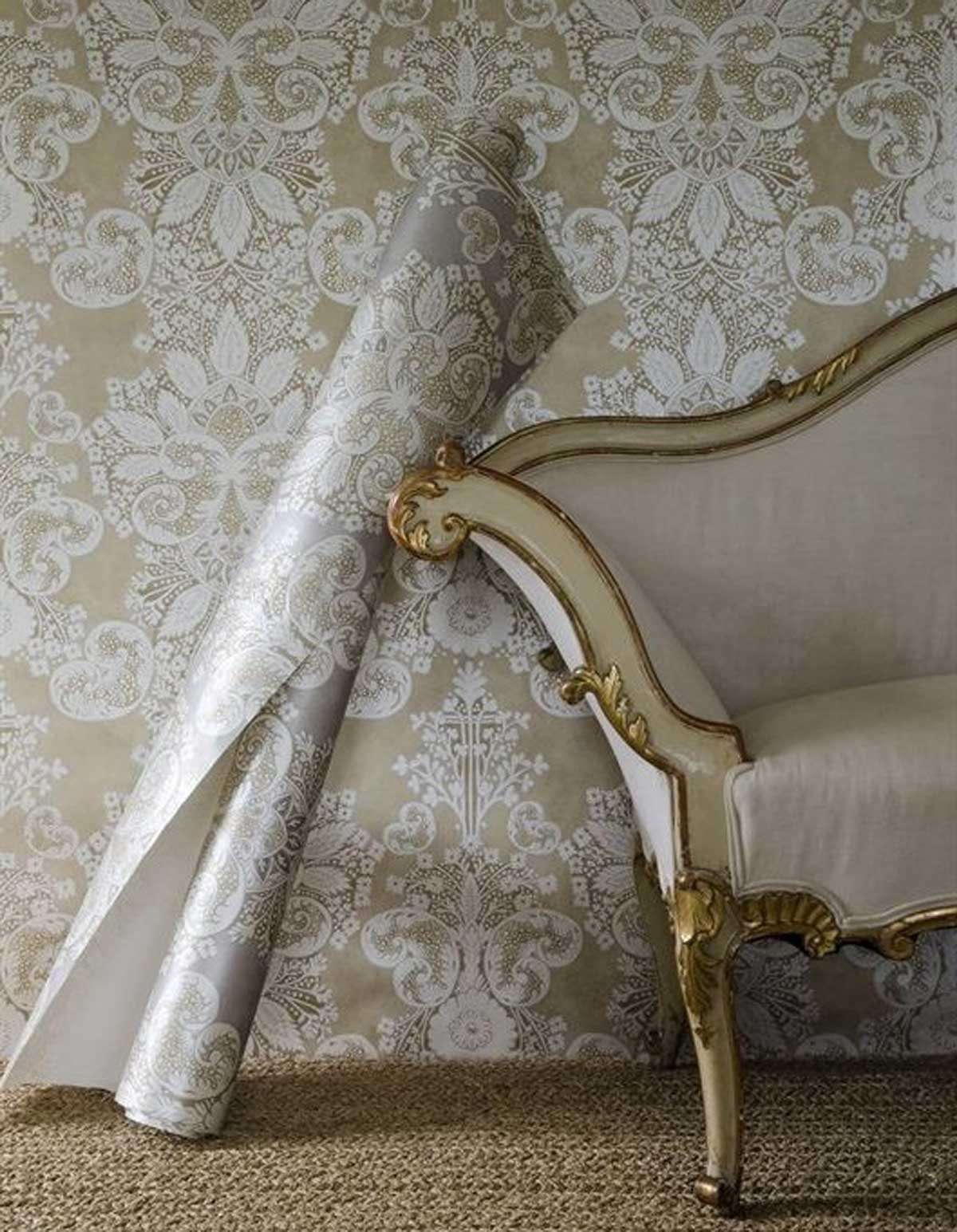
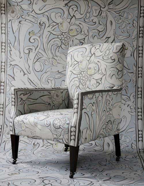
Award-winning, artist in demand, Melissa White began her career in recreating Elizabethan wall paintings and fabrics. She has since teamed up with some of our favourite brands.
Her signature style is painterly wallpapers and fabrics with an added aging effect or 'patination of time'. Following Melissa White's work with Zoffany, Lewis & Wood, and Kit Kemp, we caught up with her to find out more.
Zoffany Wallpaper and Fabric Collaboration
You designed the Arden Collection for Zoffany, how did that collaboration come about?
It was thanks to the people at QEST. In 2007 I won a QEST Award (The Queen Elizabeth Scholarship Trust) to help further my skills as a “painter stainer”. They are the charitable arm of the Royal Warrant Holders Association and they support excellence in British Craftsmanship.
The award has opened many doors for me including an introduction to luxury interior furnishings group Walker Greenbank PLC. Their brands include Harlequin, Morris & Co, Sanderson (royal warrant holders) and Zoffany.
I had my first meeting with design director Liz Cann in summer 2010 and the Arden Collection developed from there. I designed the collection with my then studio partner David Cutmore.
What do you like most about working with Zoffany?
I believe we were very lucky to design our first fabric and wallpaper collection with such a reputable brand. We were in nurturing hands as the design team guided us through the process from design to manufacture to marketing. It was an incredibly exciting and fascinating process.
You are known for reproducing Elizabethan wall and cloth paintings how is this reflected in the Arden Collection?
David and I had spent over 15 years researching and reproducing Elizabethan wall painting. We had a large database to draw on for the Arden Collection.
With Liz Cann’s understanding of the Zoffany customer we selected a range of designs that spanned about 100 years. They celebrated a diversity of styles that were in fashion at the time.
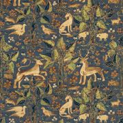
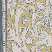
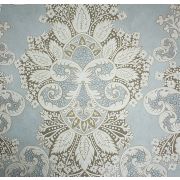
These range from the mid-16th Century Arden which looks backwards to medieval tapestries and bestiaries to the ultra-modern looking Merchants Stripe which is from a very unusual mid C17th wall painting.
Your collection was well received with Verdure print winning the Best Printed Fabric in the Homes and Gardens Fabric Awards 2012 and being nominated for an Elle Style Award. How did such recognition feel?
That recognition was fantastic and it confirmed my long held belief that these rare designs really are special and deserve to be dusted off and re-introduced after hundreds of years buried away. They are a direct link to our largely forgotten Elizabethan decorative heritage.
What was different about working on Stand Wood for the Zoffany, Darnley collection?
Each time I have designed for Zoffany the starting point has been very different according to their design concept. When head designers Peter Gomez and Claire Hart visited my studio they explained the “country house living” storyline for Darnley which was inspired by a visit to Chatsworth.
They had gathered images inspired by stately homes and the countryside and left me to draw them together in a bucolic composition that encapsulated the theme. It’s a joy to embark on a new design for Zoffany when they have such a clear vision in place.
Shop the Zoffany Collaborations
Painterly Technique
What techniques do you use?
All my original artwork is hand painted unless you include a little stencilling here and there. I paint on fabric and on plaster using an ageing technique I’ve developed over the years. When my designs go into production then they are printed industrially using various intriguing processes.
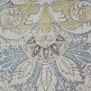
The Verdure fabric and wallpaper are digitally printed to maintain the painterly feel of our artwork. The Canterbury fabric is also digital as any other printing process would have obliterated the fine distressing.
Tell us about the ‘patination of time’?
I have always been drawn to aged, faded, peeling, cracked, and threadbare interiors. I’m intrigued by the organic, unpredictable way fabrics and surfaces deteriorate over time. There’s a mellowing, romantic appeal to this patination.
Maybe this comes from childhood memories, the faded interiors of my French grandparents’ houses. I try to achieve the look in much of my work, partly because it distances me from the final piece and sets it apart from the here and now.
Where do you draw inspiration from?
My Elizabethan wall painting references are gold dust for me as there is so much there to inspire both reproductions and arrangements for new designs. When I travel I’m always sure to visit decorative art museums and historic houses for inspiration. You never know what historic textiles and decoration you’ll find. Otherwise books, the V&A, magazines – the usual sources we all get a thrill from.
Due to your interest in Elizabethan artwork, do you think your style has an inherently British feel?
My passion for Elizabethan wall painting has always informed my painterly style as researching these forgotten designs is where I started out as a decorative artist. As my horizons have broadened, I’ve found I’m drawn to any decorative art that reflects that honest, unfussy, almost urgent way of painting, be it in the English tradition or the folk art of America, Scandinavia, France… In fact anywhere that has a tradition of vernacular art.
Lewis & Wood Wallpaper and Fabric Collaboration
What drew you to working with Lewis & Wood?
After I was introduced to Zoffany via my QEST award, I felt emboldened enough to approach Lewis & Wood whom I had always admired for their pioneering approach to design. They seemed like a good fit, enthusiastic about working with artists and highly esteemed by interior designers.
It turned out they were keen to work with me too, so began the English Ethnic Collection with Flora Roberts and Su Daybell.
Shop the Lewis & Wood Collaboration
The Kit Kemp Collection
How did your collaboration on the Kit Kemp Collection come about?
Kit had used my designs for Zoffany and Lewis & Wood in several hotel schemes, so I was already on her radar. In 2016, she got in touch about collaborating.
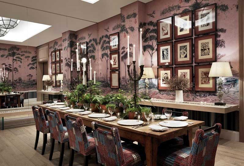
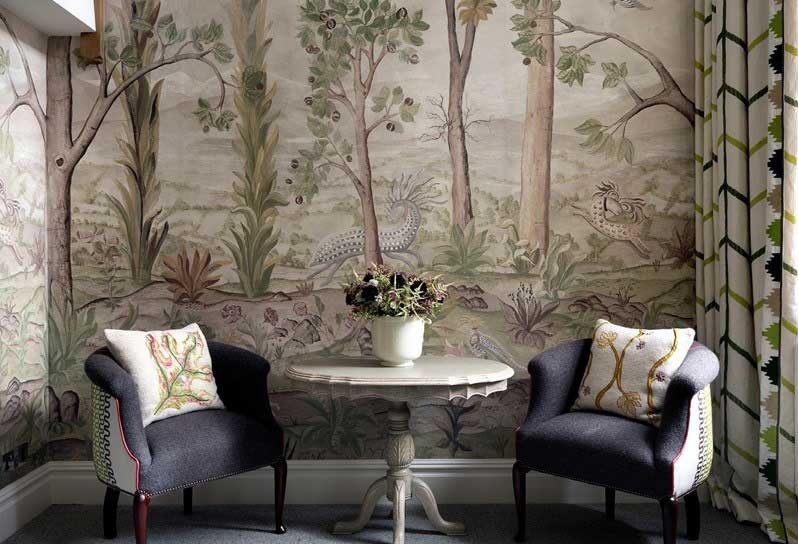
First I designed a scenic wallpaper for two meeting rooms at the Whitby Hotel then a four metre tall woodland scene for a room at the Charlotte Street Hotel.
Meanwhile, Andrew Martin had been eager to work with Kit for a while so when they decided to collaborate on a collection Kit invited me to help her design it and to provide the artwork.
What was the dynamic, being a collaboration between three creative forces?
A typical meeting with Kit is a firework display of ideas! We can’t wait to share what we’ve found in books, exhibitions, travels and archives. It really is quite a playful process and we weren’t restricted by a brief.
Instead Folk Tales grew quite organically from pure enthusiasm for our ideas. Once I had painted the artwork Andrew Martin founder Martin Waller and design director David Harris filtered and refined our designs into a cohesive collection they knew would entice their followers and attract new ones.
Kit then applied her amazing colour sense to choosing coordinating fabrics to harmonise with the collection. Flipping through the resulting pattern book it is easy and fun to pull together a scheme that reflects all three creative forces.
Where did you draw information from for this collaboration?
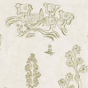
Early wood block prints were a big inspiration and feature most strongly in Wychwood and Friendly Folk. Folk art, with its honesty and charm, defines much of what Kit and I love.
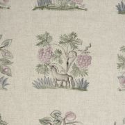
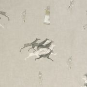
Hedgerow with its fantastical beasts, was inspired by old embroidery samplers. Great Plains fabric and Apache wallpaper emerged from naïve 19th century Native American pictographic drawings. Over the Moon began life as an energetic repeat full of comets whizzing around moons but evolved into more serene rows of moons – spot the man-in-the-moon amongst them.
Do you have a favourite piece from the collection?
Mythical Land, the collection’s headline act, started life as a bespoke wallpaper for Firmdale’s new Whitby Hotel, in New York. Kit commissioned me to design this three metre tall scenic repeat around the Mythical Creatures from her designs for Wedgwood and Chelsea Textiles.
I’m so pleased the design is now available to all as I think mural wallpapers are very much in the spotlight at the moment. This wallpaper is printed on a very matte, almost chalky paper so really looks like my hand painted original.
To find out more about Melissa White and her work, visit her website.
(Header image from All That Is Chic. Verdure Blue Wallpaper at the Haymarket Hotel image from Zoffany. Bacchus fabric image from Hannah Turcan. The Whitby Hotel image from Firmdale Hotels. The Charlotte Street image from Firmdale Hotels.)
- paypal
- visa
- mastercard
- amex

